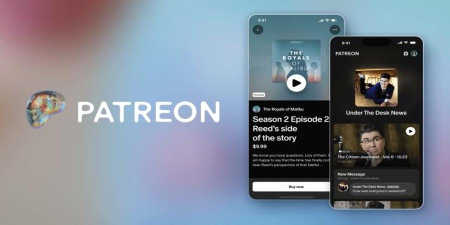
Patreon is launching new features, a redesigned app and a new brand identity, the company announced on Wednesday. In a blog post, the company explained that the changes are about “giving creators even more,” noting that Patreon is “no longer just a paid membership company.”
One of the most notable features updates is the full rollout of its Discord-like chat feature that connects creators with their fans in a group message. Patreon says the feature gives creators and fans dedicated spaces for group conversations outside of DMs and comments. The introduction of chats indicates that Patreon is moving away from solely being a place for people to obtain exclusive content, but a platform where fans also spend time discussing with others the content they’re seeing.
Fans have normally taken to other platforms like Twitter (X) and TikTok to discuss exclusive content that they see, but Patreon now wants users to have those discussions on its own platform. The company made the chat feature available to select creators over the summer, but is now rolling it out it to every creator on Patreon.
Another new change is the full rollout of a feature that Patreon announced back in June, called “Commerce,” which allows creators to sell one-off digital goods and offer free subscriptions. The feature is a way for creators to sell individual videos, audio and downloadable files to anyone, even if they are not a subscriber.
Creators can also now let people join their communities for free and offer them content and updates while keeping exclusive content behind a paywall, as creators can choose which perks they want to offer for each tier of membership. Julian Gutman, Patreon’s chief product officer, told TechCrunch a few months ago that he sees the free subscription product as a way for creators to use their subscription list like a newsletter, or a way to just reach all of their biggest fans at once. By giving users a free membership community, they may be encouraged to make a monthly pledge.
The blog post also touches on member profiles, which display things like bios, profile pictures and links to social media accounts. According to Patreon’s updated privacy policy, these profiles will include information about things like items they have purchased or what tier a user subscribes to. Since member profiles are turned on by default, users would have to opt out to avoid having their information shared. Users have taken to social media to share their concerns about the changes, noting that they do not want this information to be made public, especially since it’s done by default.
When asked about the change, a spokesperson for Patreon said users have the option to turn off their member profile by navigating to their settings.
“With today’s announcement, each member has this public profile, as well as a member profile. As of now, they look the same, but in the future, member profiles will give members more choice on how they want to show up in their communities and help them interact with fellow fans of a specific creator,” the statement reads. “Member profiles are visible to fellow fans only within a shared community — not the public — and members have the option to turn off their member profile by disabling their ‘community profile’ setting. More information on member profiles can be found in the Help Center.”
As for the redesigned app, users will start seeing an updated home feed with new posts organized by creator, as opposed to posts.
“Instead of dropping into a content overload, members log in and instantly see everything they want at a glance,” the company wrote in the blog post. “Their homepage is organized by creator, not by post, which means fans can see a creator’s latest work next to their community conversations and anything else going on in their world. It’s creativity in context, the way creators intended.”
As part of its reimagined brand, Patreon is launching a new logo and wordmark, along with changes to typography, color and photography. The company says the changes are designed for a “digital-first world, intended to challenge static, old-media brand-building conventions in favor of an identity that better reflects today’s ever-evolving creative landscape.”
Source @TechCrunch


