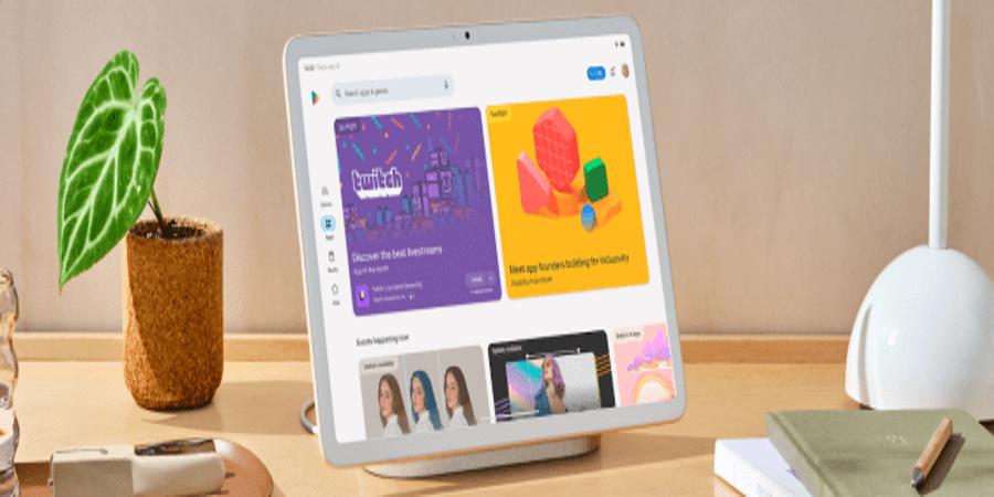
Following this summer’s launch of the Google Pixel Tablet, the company says it’s updating its Google Play Store to better showcase apps designed for large-screen devices. The changes will help users find high-quality apps for tablets via refreshed app listing pages, ranking and quality improvements, streamlined navigation and a split-screen search experience, explains Google.
For starters, the new store listing pages for games will now include a video banner at the top of the page, if one’s available, which allows users to get a better sense of the gameplay offered. In addition, the apps and games details pages have been reorganized in a multi-column layout, which looks better on tablet devices and brings more of the developer’s content into view, without having to scroll down.
But the bigger news for Android app developers is that Google is now pushing developers to build “quality” apps for tablets by changing how apps and games are ranked in search results and in the Apps and Games home pages, and other curated collections.
In short, those that adhere to the company’s guidelines for large-screen apps will now rank higher than those that don’t.
Google says the change will help users find apps that resize well, aren’t letterboxed and support both portrait and landscape orientations.
In addition, featured sections on the Google Play Store will consider this factor as well, including high-profile spots like the Editor’s Choice and other curated collections and articles.
It’s also extending its technical quality bar that was originally designed to reduce visibility for apps and games that didn’t meet specific technical guidelines to large-screen devices as well. That means apps and games with an 8% user-perceived crash rate or 8% user-perceived ANR (Application Not Responding) rate will be impacted by having warnings added to their pages and will see their visibility reduced. These changes will roll out in late August, Google warns.
Meanwhile, apps and games that follow Google’s content quality guidelines and support larger-screen devices will also “occupy more screen real estate on Play homepages,” says Google.
In terms of store navigation, Google moved the Top Charts and Categories sections to the Apps and Games Home. And on tablets and Chromebooks, it made the Kids experience a primary tab, as these devices are often shared with children.
Tablet users will also be able to take advantage of split-screen search on large screens, where search results and app details can be viewed side-by-side.
The changes will roll out in the coming weeks, the company says.
Source @TechCrunch


