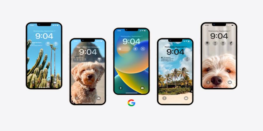
Google’s anticipated iOS 16 Lock Screen widgets have now begun to arrive. Alongside the launch of Apple’s new mobile operating system, iOS 16, the search giant last month had teased its plans to support the iPhone’s newest feature that allows users to place widgets directly on their phone’s lock screen, offering information and easy access to favorite apps. Google said it would soon release widgets for a number of its top apps, including Search, Maps, Gmail and others.
Google’s set of iOS 16 widgets are now becoming available, following rollouts that began last week with updates to the Chrome and Drive apps.
With the latest set of app updates, Google users can add Lock Screen widgets for popular apps like Gmail and Google News, as well. However, the two most in-demand widget releases — Search and Maps — are still pending. And Google has yet to announce plans to launch a Google Calendar widget, for some reason, despite the fact that easy access to your daily schedule is one of the better use cases for iOS 16 Lock Screen widgets.
The new Gmail widget comes in all three sizes: circular, rectangular and inline. The first two are meant to be placed below the clock on the Lock Screen, while the inline widget appears above as a line of text.
In Gmail’s case, the inline widget will display a shortened date (like “Wed 7”) followed by the number of messages in your inbox. (In case you like to stress every time you look at your iPhone!) Meanwhile, the rectangular widget breaks down how many new messages are in each category — like Social, Updates or Promotions — which helps you to determine if the emails you’ve received are actually important. The smaller, circular widget just displays how many new messages you have.
The newly added Google News widget brings short headlines to the Lock Screen as a rectangular widget. When tapped, you’ll be taken directly to the Google News mobile app to read the full story. This one can be a bit hard to read for those with poor eyesight as it may try to cram as many as four lines of text into the small space provided. While you can likely see that fine in the blown-up image below, viewing this on a phone screen is more difficult.
Drive and Chrome’s widgets arrived a few days ago. The former offers a rectangular widget for quick access to Drive’s “suggested files,” as well as two circular widgets to either search your files with a tap or access your Starred files.
Chrome’s widget offers a variety of options, including a circular widget that you can tap to launch Google Search within Chrome — a good workaround until the default Search widget arrives — and three others for launching incognito search, voice search and even Chrome’s “Dino Game” that typically appears on the desktop when you’re offline.
We anticipate the launch of the Search and Maps widgets soon. Search, similar to Chrome, will let you start a Google search from the Lock Screen, including a voice search. But we’re awaiting the Google Lens and Google Translate widgets that ship with this one. Lens, in particular, is where a lot of Google’s innovation today lies as it prepares to expand its multi-search experiences that combine both text and images for more advanced queries.
Maps, of course, will be useful to regular communters who want to see real-time traffic updates and estimated travel times to places like your office or home address.
Google hasn’t yet offered a time frame for its other widget releases, but given the cadence of these updates, they should be here soon.
Source @TechCrunch


